5 Characteristics of Great Logo Design
Anyone can squiggle ideas down for a logo, but designing one that perfectly represents your business is a whole different story. Your logo is the face of your brand, and branding is a key aspect of a successful business.
To have the potential to become an iconic brand, here are five characteristics your logo should be:
1. Simple
2. Timeless
3. Relevant
4. Distinctive
5. Memorable
1. Simple
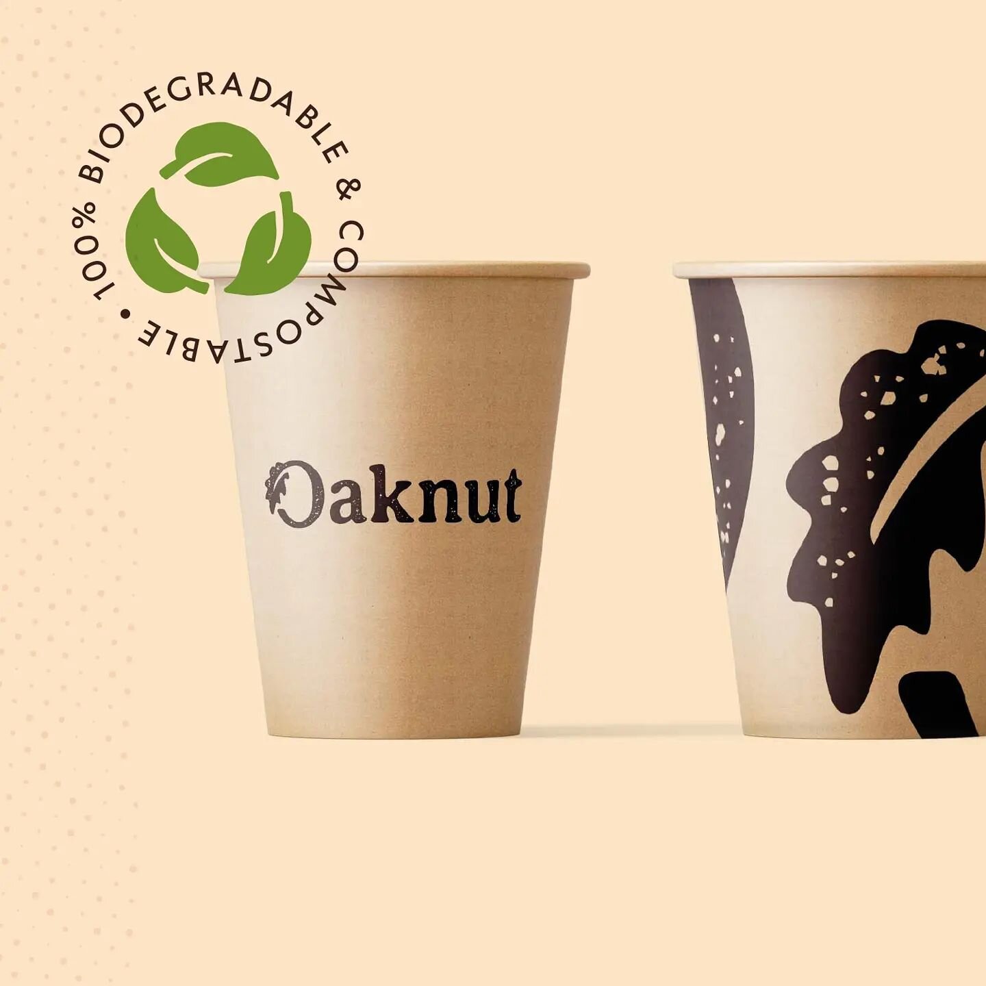
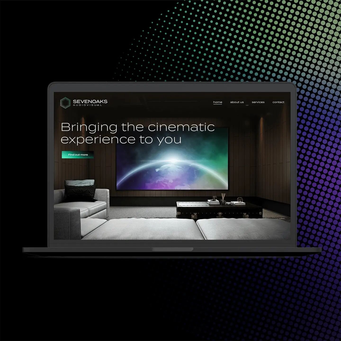
Possibly the most important quality to keep in mind when designing a logo is simplicity. A simple logo is easy to remember and easy to recognise. However, while a simple logo mark or typeface may seem quick and easy to come up with, if done well, there's often a lot more to it than meets the eye.
After hours of research, sketches, concepts and refinements, it can be difficult for others to realise the process behind the simplest of final outcomes. That's when you hear the tabloid headlines of “£100,000 for a logo!”, disregarding a whole host of other work involved in the project, from strategy and marketing plans to brand guidelines and collaterals.
For the end user or consumer of the brand, the logo (or packaging, website, user interface etc), can easily be overlooked. Most people don't care about how a logo was made with a grid or how you altered the kerning on the type, but the logo will still make an impression subconsciously, affecting our buying decisions, productivity and overall feelings towards the brand.
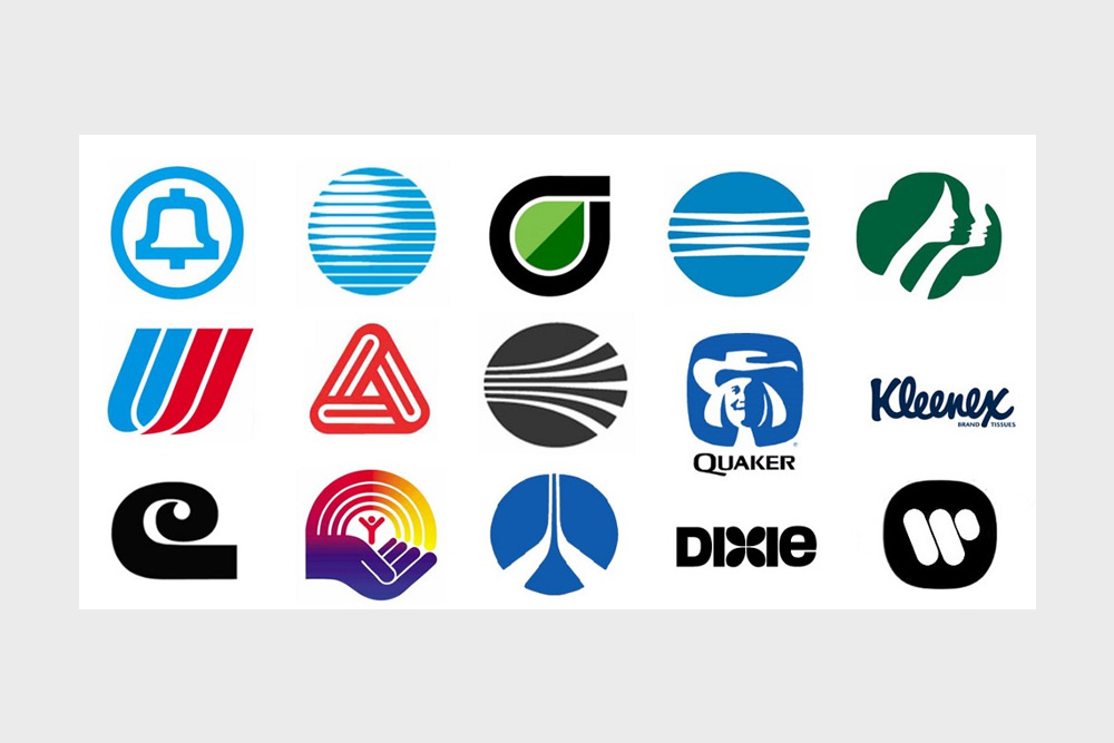
In our digital age, logos are being seen in smaller sizes than ever before. I'm writing this section on my phone and can instantly see logos in the notification bar which are no bigger than a few millimetres, but I can still recognise what they are. This is massively due to their simplicity. For example, the Reddit logo is made up of a few circles and a smiley face, yet as soon as I catch a glimpse of the icon I know exactly what it is.
This shows the importance of thinking small and how your logo design will look when scaled all the way down to a thumbnail. If there's too many elements and you create a logo that is overly complicated, more often than not it won't be legible at a smaller size. Keep it simple, but different enough to be distinctive.

Logos are being seen much smaller on phones and thumbnails.
2. Timeless
When I began creating logos in my teens, I fell into the trap of following the latest trends in a bid to create something modern and up to date. As it turns out, I was actually creating something that would be outdated within a year. In comparison, when I look through logo books for inspiration, some of the best and most well known logos in there were designed 50+ years ago, yet are still effective and relevant to the modern day.
Following trends may work for a year or two, but soon enough the glossy web 2.0 and generic swooshy characters will look old-fashioned and be a sign of their time. A good logo, on the other hand, will pass the test of time, looking as good and being as effective as the day it was designed.
Don't add a gradient just because that's what everyone's doing at the moment; add one if it's the right decision and will benefit the logo and is relevant to the brand. If you follow trends just for the sake of it, you’ll always be one step behind.
Classic logo designs from Saul Bass.
3. Relevant
This may seem an obvious point, but you would be surprised at how many designers tend to forget what type of business they are working for, and create a logo or symbol just because “it looks nice”.
The logo needs to be relevant to the business, but doesn't necessarily need to be a literal representation of it. For example, a logo for an IT company could be a clever concept based on a computer network; it doesn't have to be an actual monitor and mouse icon.
This applies to the font in the logo too. The typeface needs to be relevant to what the brand is about and how they want to be perceived.
If you're designing a logo for a funeral service, it's probably best to steer clear of a chunky bubbly font. It doesn't match the values of the company, who want to appear professional and trustworthy. Instead, it would give the impression of something childlike, such as a nursery or a kids party service. Whereas if you opted for a classic serif font, e.g Garamond, it gives a much more relevant impression to the viewer.
The logo is often the first thing people see of a new company, and it only takes a matter of seconds to make a judgement from that. If the logo design is relevant, people immediately feel a sense of trust and that the company is reliable and authentic.

The FedEx hidden arrow could represent speed and forward direction.
4. Distinctive
This is what sets the company apart from the competition. It's no good if your logo can be confused for a thousand other businesses, so creating something that is different from everything else in the industry while still being relevant is a big step towards a successful logo.
Finding this balance is one of the toughest parts of the design process, and is often the difference between hiring a professional and an amateur, buying stock logos, or crowdsourcing competitions.
When the designer has a spark of inspiration and develops a concept that is distinctive, it feels like a huge obstacle has been passed and you've found a direction to pursue. I've been guilty in the past of presenting too many different logo options to the client, in the hope that there's something in there they like. Rather than this, it's better for both the designer and the client to focus on a few strong concepts that tick all the boxes; it should be quality over quantity.
Combined with the other characteristics in this post, a distinctive logo helps to differentiate your company from its competition. Having an instantly recognisable symbol of wordmark is difficult to execute, but heaps the rewards in the long-run.

The classic Shell logo is instantly recognisable.
5. Memorable
The combination of a logo being simple, timeless, relevant and distinctive often results in a memorable logo, too.
As soon as you hear the names McDonald's, Nike, Starbucks, FedEx and so on, you can picture the logo in your head. This is partly as these companies are so big, but also because their logos are executed well and their brand remains consistent.
If these logos were complex, outdated, irrelevant and common, you would have a much harder time remembering how they look. Although as these are world famous brands, you would see them so often that eventually your memory would retain their appearance.
On the other hand, the average company or start-up has much less of a chance to make a lasting impression with their logo and brand identity. Instead of having the budget to market through TV ads, billboards, posters, flyers, liveries and everything else, the majority of businesses will have to pick just a few means of advertising. In order to have a good return on investment, there needs to be a strategy in place to ensure it's worthwhile.
While each different method of advertising has their benefits, the logo will remain the same wherever it's applied. Whether it's seen on a billboard as you whizz past on the train, or in the corner of a tiny web banner as you scroll down a page, the logo needs to be noticed and be memorable.
Of course the logo is only a fraction of an advertisement, and the use of imagery and typography can be used to get a message across, but the logo still plays a part and in some cases is the cornerstone to how an advert looks.
With the blend of these elements, a memorable logo shouldn't be too hard to come by. In an ideal world your target market will be able to paint a picture of your logo in their head, keeping you in their sights and potentially lifting you above your competitors.

The golden arches of the McDonald's logo are world famous.
It's easy for companies and start-ups to overlook logo and brand identity design, and it's often right down the queue in the priorities list.
However with a specific goal to target, such as to increase brand awareness, reach a more relevant audience, generate more web traffic, or even a combination of these for a start-up with no existing identity, logo and brand identity design can make a huge difference to the success of a company.
With these five characteristics, the logo can be pivotal for this success.