Using HTML and CSS to Customise my Squarespace Website

Until a year ago, I’d never used any form of HTML or CSS, or any programming language for that matter. It always appeared so complicated and daunting whenever I would see a block of code from a website. To me there was no in-between; you were either an expert and could write code to do anything you want, or you had absolutely no idea of what was going on at all.
But the idea of web development still interested me; it was all well and good designing a website to then hand off to someone else for development, and hope it turned out exactly as you designed it, but I thought having at least a basic understanding of how it would be built would be beneficial. It would make me a better designer, as understanding the framework behind elements on the page, such as the header or navigation, would be implemented to the design decisions I made. It could open up a window of new possibilities as to what you can achieve on a web page, none of which I would be aware of without a basic knowledge of HTML and CSS.
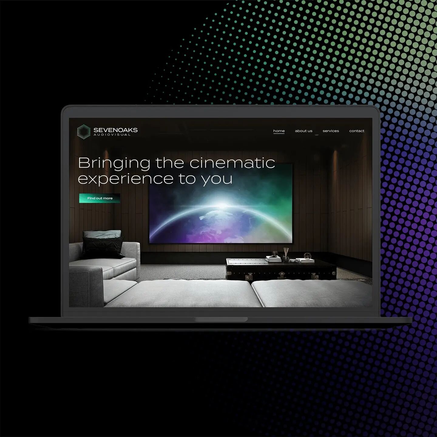
At the time, I had a Squarespace website selling football-related prints. After using the default templates and design features for a while, I wanted more control over the customisation of how my website looked. Squarespace offers plenty of options in terms of templates/layouts, fonts, galleries and everything else you can put on your page, but there were a few specific adjustments I wanted to make that weren’t available in the Squarespace Style Editor tab. However, Squarespace offers a ‘Custom CSS’ section, where you can enter your own code to adjust the appearance of your website to get it looking exactly how you want. So I knew it was possible to make your own tweaks, I just didn’t know how to achieve them. After reading a few recommendations on learning basic HTML and CSS, I decided to give Codecademy a try.
Codecademy
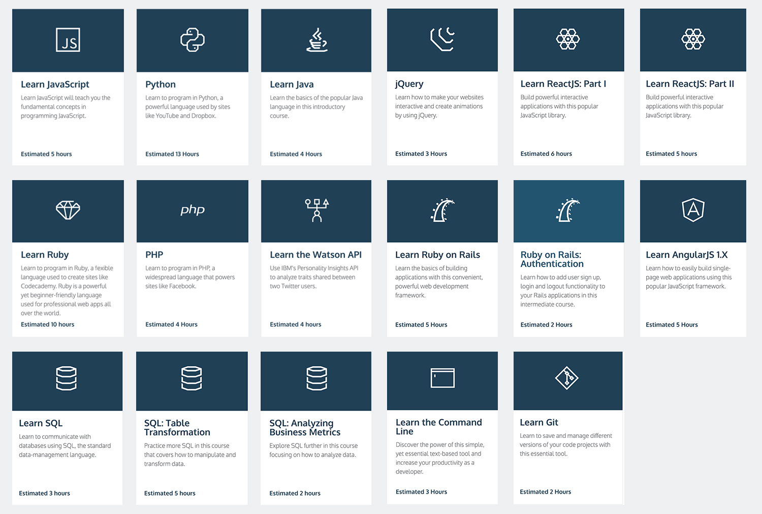
Codecademy was the perfect place for me to start. It's an online platform where you are taken through courses, step by step, to learn HTML, CSS, Java, Ruby and many more. You don't need to have any kind of coding experience to get stuck in; everything is explained for you as you go. As soon as you sign up, you're presented with a number of different courses for various languages.
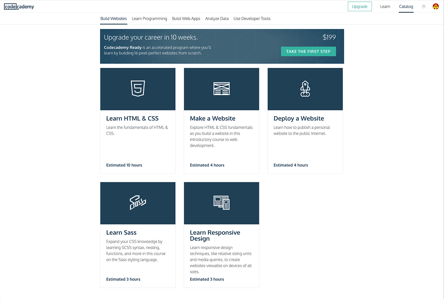
I chose to start with the courses focused on web development, which were ‘Learn HTML & CSS’, ‘Make a Website’ and ‘Learn Responsive Design’. For each course, the interface is split into thirds. The left section displays instructions and explanations for the steps you need to take. The middle shows the area for you to write your code, and the right is a live preview of how it looks on the front-end.
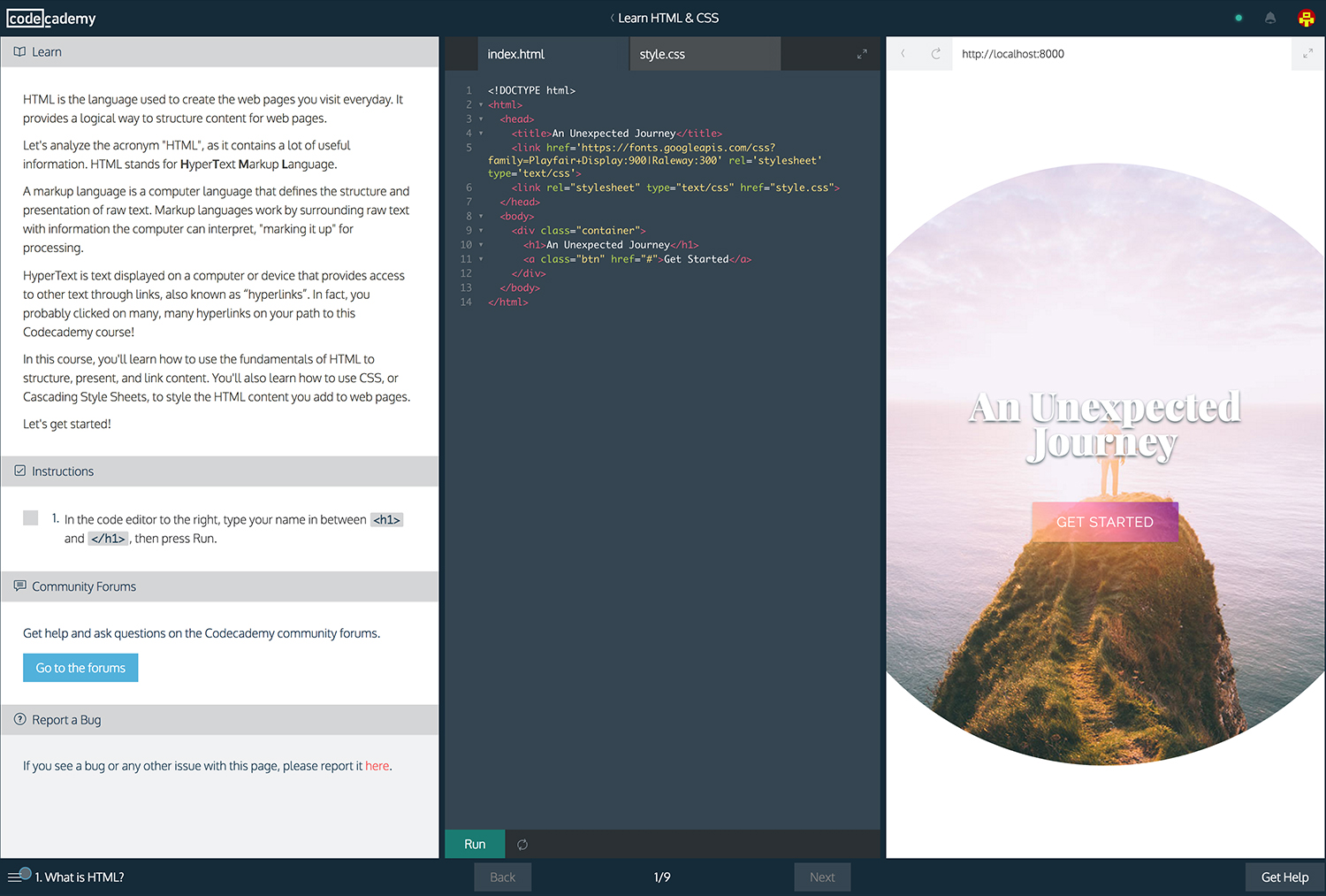
The layout of the interface and simple instructions is what makes Codecademy such a good platform for beginners. Rather than technical jargon, it uses basic English that is easy to understand and explains why the code you are writing has the given effect.
If for any reason you come to a halt and can’t figure out how to get to the next step, there’s a button called ‘Stuck? Get a hint!’, which comes in very handy when you’re banging your head against a wall wondering why your expertly written code isn’t quite right. Or if you want to take a break and come back to the course, Codecademy saves your progress for you to return to at a later date. Perfect for when you don’t have to time to plough through a whole course in one sitting.
Not to mention, it’s completely free.
There’s a huge catalog of courses for you to take without having to pay a penny, although if you wanted to take your coding skills to the next level, Codecademy offers a couple of upgrade options for you to really test your ability, with the likes of live technical support and reviews on your work from developers.
Over a few months, I completed a variety of the web development courses and gained a basic understanding of HTML & CSS.
I then attempted to build the foundations of a portfolio website from scratch in Adobe Dreamweaver, which turned out to be very good practise and a huge learning curve. It didn’t take long to find that the preview in Dreamweaver was miles from how the website would actually look, but to simply practise writing basic code then it did the job perfectly well.
I designed the layout and content of a variety of pages, experimenting with features such as a fixed header image, parallax scrolling with overlaying text, flex-box services icons and testimonials in a Pinterest/masonry style format.
I also practised with media queries and mobile optimisation. A lot of designers are perfectionists, myself included, so having the ability to refine and tweak how a website appears in various sizes meant I spent hours playing with the layout on mobile and tablet.
After more reading, experimenting and practising, I began to implement these skills within my Squarespace site on the bits and bobs I couldn’t change through the default Style Editor.
Here are a few examples of the custom CSS on this website:
Fixed Header
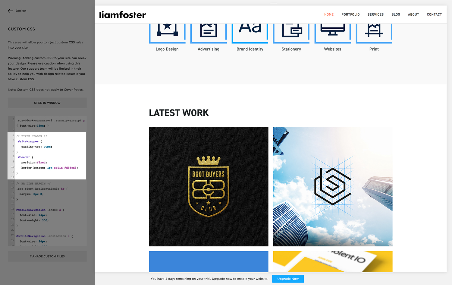
I decided I wanted a fixed header bar to give viewers easy access to the navigation. As some of the pages are quite long, I didn’t want users to be scrolling all the way up to the navbar or all the way down to the index in the footer, so it made sense to make the header fixed. This was very simple to achieve:
#header {
position: fixed;
border-bottom: 1px solid #d8d8d8;
}
#siteWrapper {
Padding-top: 70px;
}
I also added a thin border to the bottom of the header, as it helps to separate away from the main body content as you scroll down the page. 1 px is the height (1 pixel), solid is self-explanatory (could be dashed/dotted), and then I chose the hex colour to be a slightly darker grey than the background colour.
However, with the header being fixed, the overlaying text on the homepage banner appeared off-centre, as the header was now ‘sitting’ on top of the rest of the site. So to solve this I had to cheat a little; I added 70px padding to the top of the entire site, creating the illusion that the content starts underneath the header, therefore centralising my banner text again. Jobs a good’n!
Mobile Navigation
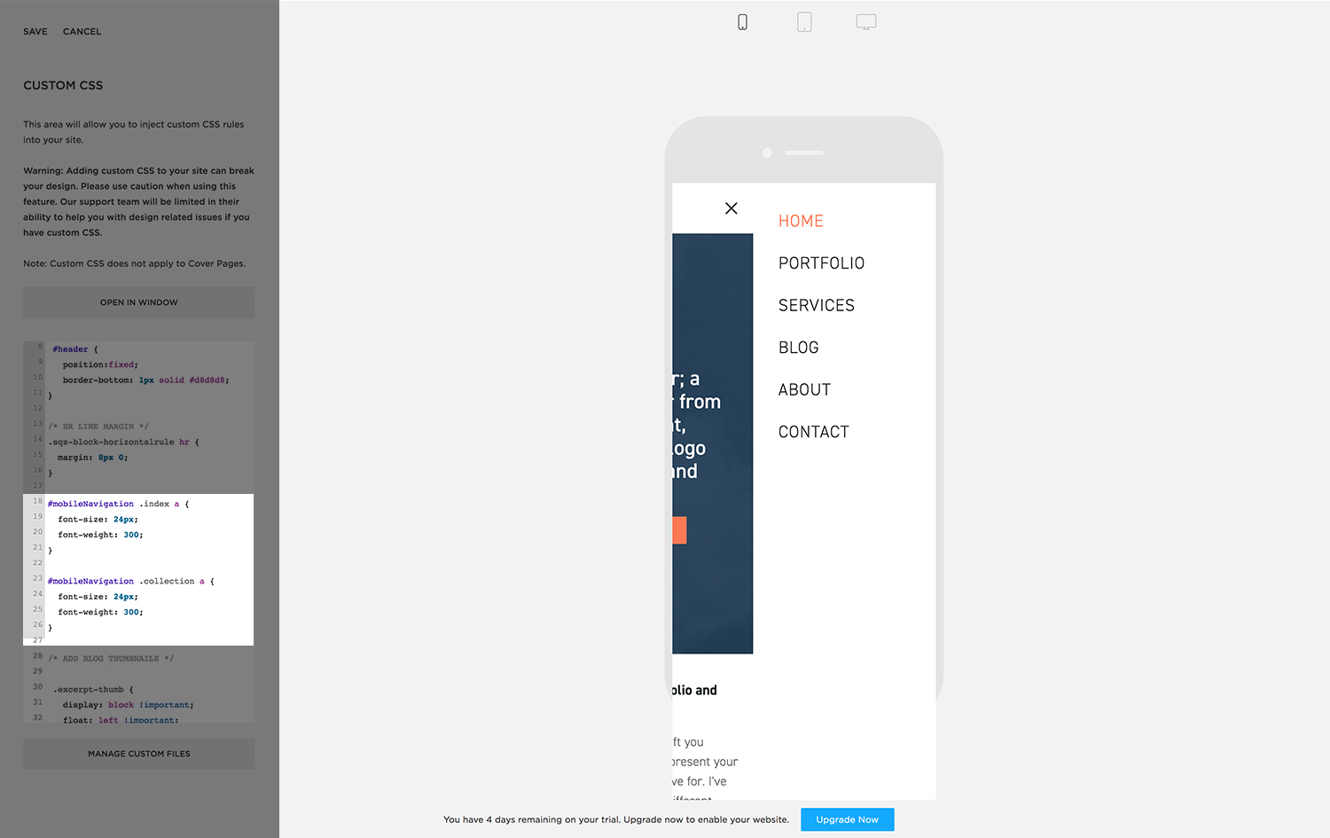
I also found the font size in the mobile navigation to be too small. I wanted to make the navigation on mobile easier to click, so I used the unbelievably handy ‘Inspect Element’ tool to locate the relevant code. To ‘Inspect Element’, simply right-click on a part of a webpage and select it from the menu. It lets you find specific parts of the HTML and CSS files on the site, and helped me massively when learning how to dismantle webpages. Once I found the name of the navigation, it was nice and easy to achieve:
#mobileNavigation .index a {
font-size: 24px;
font-weight: 300;
}
You may have also seen the font-weight presented like this before; to put it simply, the higher the number, the bolder the type. These usually range from about 300 to 800, or something similar depending on the font.
Blog Thumbnail
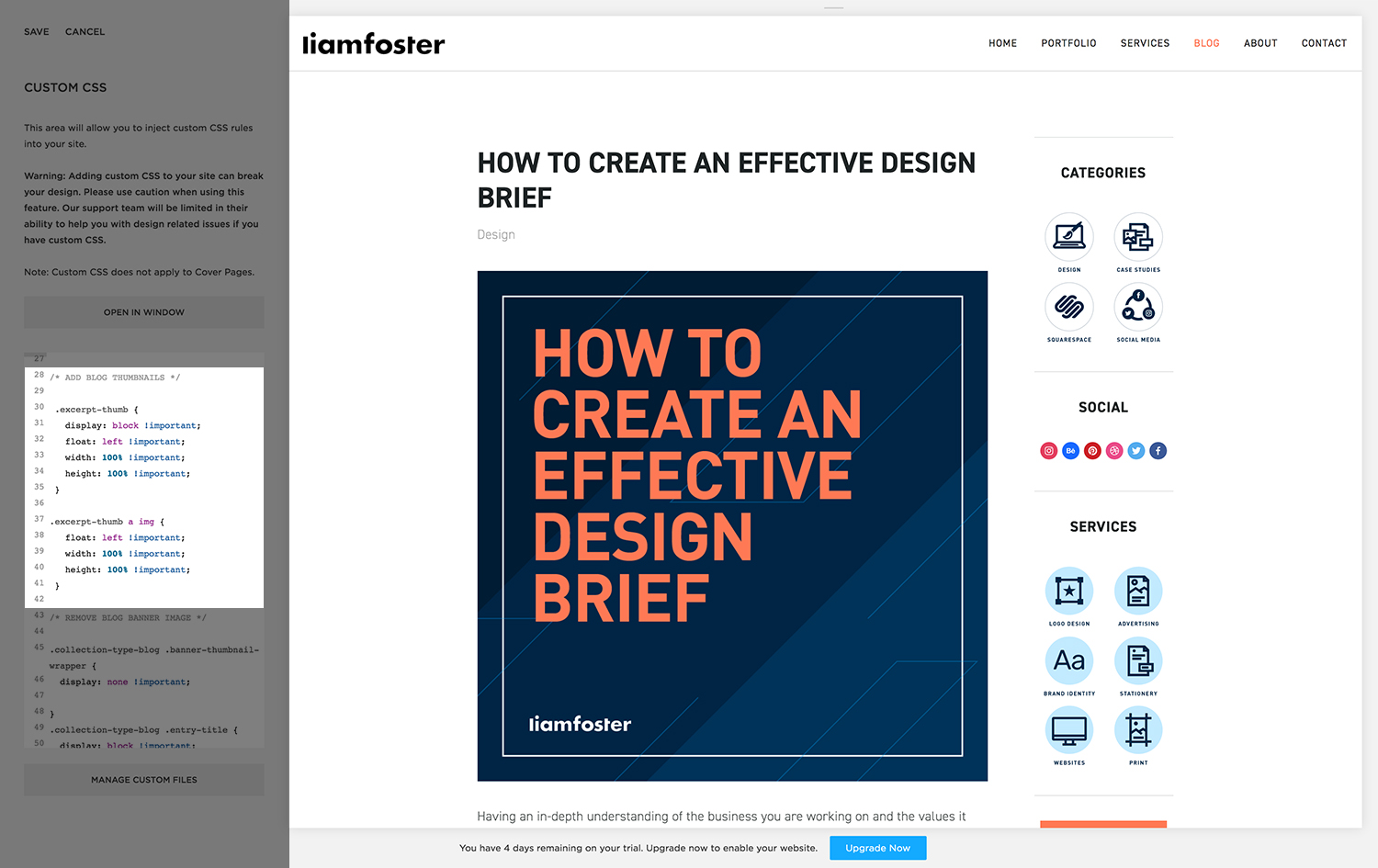
Another tweak I made was to the blog home page. I wanted the post thumbnail to display above the excerpt, but on the Bryant template there was no option to do so. Inspect Element saved me again for this one; I found the name of the excerpt thumbnail and experimented with the CSS until the thumbnail finally appeared, just like magic!
.excerpt-thumb {
display: block !important;
float: left !important;
width: 100% !important;
height: 100% !important;
}
.excerpt-thumb a img {
float: left !important;
width: 100% !important;
height: 100% !important;
}
Another issue I had here was adding a thumbnail in; the template would add this image as a banner at the top of the page, by default. However I still needed to add a thumbnail to have it show in Summary Blocks for ‘Related Posts’ etc, so I simply turned the banner image to hide (using display: none), meaning my thumbnails would still show up everywhere else!
These are just a few examples of how I implemented some basic HTML and CSS into my Squarespace website. Having the ability to tweak and refine your website to get it looking just right is very satisfying indeed. I still have plenty to learn, but it’s a good start!